Thursday, August 18, 2011

Middle stages of 2 paintings


A removed stage of beach painting.  Oil on canvas 24" x 36"

Middle stages of beach painting.  Oil of canvas, 24" x 36"
In some ways the time since my last posting has been art making nothing land.  In others it has been very busy.  Almost all my spare time has been taken up with organizing my archive of works so that we can finish the new web site I have found scanned and enhanced dozens of bad photographs of early work.  I now have hundreds documented, but have no record of large part of my earlier work, especially paintings I did prior to 1995. 
I did make also make some progress on the beach painting I have been working on.  The pictures show some of the progress and changes that I have made.   The changes are huge, because the first incarnation wasn’t working.  I am much happier with my current direction.  I was starting to get away from my core, and into something resembling graphic arts.
 I am now at the stage of blocking in the colors.  In some ways it is the most difficult stage, because the whole thing looks messy and nasty, but it is also the stage in which the basic drawing is perfected, and the tonality of the whole painting is established.  On a large painting like this it is also very boring.  Before my last posting I had also made some progress on the painting of Fisherman’s wharf.  I am at much the same stage on this painting as well. 
Middle stages of Fisheram's wharf painting - Oil on canvas "18" x 24

At the sales end of the process, the exhibition at the McGuffey center in Charlottesville is finished.  I didn’t sell anything, but at this stage that was not to purpose.  It was a chance for exposure to a higher art market.   I had a moment when picking the paintings up.  They said that we were to pick up our paintings from 5:00 pm.  So I thought that I was safe arriving at 6:10 after a 1 hour and 20 minute drive from work.  A got there to find the whole building locked up.  To my relief,  one of the studio artists was working in his outside studio, and had keys.  Fortune was smiling on me.  I didn't sell anything but at this stage that was not to purpose, I did receive a request to use my material for promotions though, which was a plus.  We will see what comes of that.  These couple of days off, I had better get some painting done before a get myself into an artist’s block again.

Monday, August 1, 2011

Administration work ... so boring but important.


Fly away home.  oil on linen, 10" x 8"
This painting was one of the first in my current series.  The text is mostly hidden and make a connection between the rime "Lady but fly away home" and my connections with immigration.

I soooo want to be painting. Instead I am still organizing pictures into a data base, with all the information about each one that you would ever want to know. There is a purpose in all of this. We are working on a new web site. The old one has been up forever because it was so hard to revise. This one will be much easier. But in order to do it, we have to be able to keep track of pictures. The final naming format I came up with is as follows.
(m201103n0165ool-e008x010lanr-tr0.jpg)
  • m is for the level of quality ranging from an artist's exercise, to a masterful work.
  • 201103 is the year and month the work was completed in.
  • n0165 is the unique file number assigned to the painting. The zero enables me to have exactly the same number of characters in each file name. That way I can easily divide a list of file names on a spread sheet into its constituent parts, and sort by any one of them. With drop downs on the spread sheet I can also generate a file name for a new work without making any mistakes.
  • ool a code for the medium. In this case it stands for oil paint on a stretched linen canvas. Using a search and replace, I can convert this into a number so that it will easily be imported into the Access database table.
  • -e lets me know what the size of the digital image is. In this case the largest dimension is 1800 pixels.
  • 008x010 gives us the dimensions in inches. Once again the zeros maintain the right number of characters. This painting is 8 inches high by 10 inches wide. With 3 digits I think I am safe even with a 60 foot backdrop.
  • lanr has to parts that stand for the type and subject of the painting. Here it stands for a landscape of a natural setting, other than costal or urbane. It works in the same way as the code for the medium.
  • -tr stands for the style used. In this case it means "texted realism" which is my current "thing"
  • 0 tells me what stage in the painting this picture was taken. Here 0 means that the picture was completed. It enables me to have a consistent completion number as I may have varying numbers of pictures taken while the work is in progress. You may have noticed that I post progressive pictures now and then. In future if an article gets published about the piece I can easily identify the stages for each painting.
Coming up with all of this has been a pain because each time I changed the nomenclature, I had to rename all the pictures .....geeeeerrrrrrr!!!!!!
I have gotten some painting in. I have been making steady progress on the painting of Fisherman's wharf that I am doing for the Oil Painter of America competition early next year. So it has not been all work and no play. I will post a picture of the progress on my next posting.

Saturday, July 23, 2011

Of archiving and file naming


Detail of  "The Potter"  (unfunished)
The last two days have been days off, and have been very hot and humid, up around 100 F.  I was not about to spend my them out in that kind of heat doing yard work, so apart from mowing early one morning, I got to spend most of it doing art “stuff”.  I made a start on the main painting that I am going to enter into the Oil Painters of America Nationals next year.  I got it mostly drawn up with the sky and bay roughly grubbed in.  I am aiming to become a signature member of OPA.  In order to do that, I have to have been accepted into their national exhibition 3 times in 5 years.  There are usually about 3000 entrants, with only a couple of hundred accepted, so the competition is stiff and the work entered must always be excellent.  That is why I am giving myself more than six months for the project.  The works entered have to literally be master pieces.
Other than that most of my art time was spent doing digital archiving.  One thing can lead to another.  We have been offered some free Google advertising.  Our aim will be to get people to come visit our web site. It has sat mostly dormant  for a couple of years.  (see us at www.skillart.org ) We are in the process of getting a vastly better site up.  It is much less cluttered and much easier for us to access and regularly change and up date.  So now getting that up has a rocket under it.  In order to get it up, the archive has to be decent and in order.  We have many of copies of pictures of paintings of varying quality all over the place. 
I have put together a database in MS Access in order to pull it all together.  Firstly I had to find the best pictures of every piece of work.  Then I had to rename them all.  To do that I also needed a lot of information about each work.  We are using a naming system that tells you at a glance a lot about the painting.  An example is e200706-00062acb-0140x0180ameq-rr0.jpg.  The name can actually be divided into columns in Excel and translated into understandable information.  The nomenclature of this painting divides up as follows: e the image has a max dimension of 1800 pix. 200706 painting completed June 2007, 00062 is a unique catalogue no., acb the medium is acrylic on canvas board, 0140x0180 the dimensions are 14” high and 18” long, ameq it is of animal/s, namely equestrian, rr it is very realistic, 0 it is the base picture of the completed work.  With all of that in the file name it is easy to do the rest.  Unfortunately it is also tedious.  On the upside I found a recent painting that I had forgotten about. It  needs a little work to complete.  I put it aside when I was making the transition to working with text again.  With just a little work it will become a nice part of my new body of work.  The work, the potter, of a local potter at a festival, is posted above.

Sunday, July 17, 2011

Revisiting old paintings that you thought were failing


My unfinished painting of lone tree sunset.  18" x 24", oil on canvas
I was faced with a problem the other day; I had run out of surfaces to paint on. No problem, I just ordered some from Dick Blick. It really is a great way to get supplies when you live an hour or more from the nearest craft store. The prices are also great. Unfortunately I was then left with the problem of how to use precious painting time while I waited the week or so for my canvases to arrive.  I have shelved the beach painting, and was not feeling like working on the portrait, so I dug into my cash of "failures". One of them was started with grand hopes of making an impression at the local Universities group show. The painting was of a very large prominent house at sunset. Everything was going well until I started painting the sun set.

Over the years I have painted quite a few of them and found that they are a most paradoxical subject. On the one hand painting a red and orange sky with some trees silhouetted against it, is one of the easiest ways for a beginner to wow their friends. Conversely, if you want to capture the depth and subtlety of one, it takes a lot of experience and skill to achieve well. I repainted this sky several times. By the time I lost steam all I had was a blue grey under painting. The canvas kicked around in wardrobes and boxes for about 3 years before I finally picked it up to have another go. It is not finished yet. I still have more to do on the house, and have to add text so as to fit it into my current brand, but I am pleased with my progress.

First I managed to capture a real feeling for the thin translucent layer of cloud with the colors of the setting sun glinting off their uneven base. The single tree looked great with the brilliant light silhouetting it. The house though was still a problem. It remained dark and dead, the way it was in the reference picture. Additionally it was  problematic because it added to the paintings imbalance. To compensate I lightened the house, and added lights in some of the windows and on the portico.

It is still a little imbalanced, but I am sure that the positioning of the text will solve that problem. All in all, I am pleased with the results. Over the years I have found that paintings that have sat for a long time, when returned to, become some of my best. If you paint, don't throw paintings away when they aren't working, and don't grudgingly just accept them as evidence of your lack of ability.  Put them away and let the idea rest for a while.

Tuesday, July 12, 2011

Bending rules on muddy colors

A failed attempt
Being reworked
Today was another day at Wal-mart, were I work so that I can avoid the designation, "starving artist".  At one point I was helping a customer with a house paint purchase when we started discussing color.  It turns out that she is a hobby artist.  Of course we got talking.  One of the things that came up was what to do when a painting becomes muddy, or is otherwise not working.  I suggested that in what ever medium you are work, mud can be overcome with a glaze of color applied after the painting has dried.  So called mud is the bane of many artists.  It is caused because, once there is white in a pigment, it can not be turned dark again.  Conversely, when you have a wet underlying dark color and you try and lay a very light color into it, you can't add enough white to make it truly light.  What we call mud is actually the loss of contrast and or the intensity of colors.  There actually is no such thing as a muddy color, because that same color can work well in some other context.  Red is often a problem.  Most red pigment is some what transparent, and dark.  In a black and white picture for instance, red lipstick appears to be  almost black.  If I have a dark color and paint red over it the result will be dark, even if the paint is very thick.  In order to make red bright we could try and add white to it.  Unfortunately that creates pink.  Most beginners are taught to start with dark tones and work towards lights.  Once you lay down a dark don't mess with it too much, and where you want lights either leave the canvas white until you get to that color, or wipe it off.  A thin layer of red over the white canvas, will glow.  To successfully do this in painting a red rose take a lot of practice and control. Glazing is an alternative.  Using the red as an example.  I can get very pressies tones in the area I want to be glowing red.  I don't care that it is in fact a range of pinks.  When the paint is dry, I can lay a thin transparent glaze of red over the top, and reestablish the darks right into that glaze.  It will not turn to mud, because there is no white involved.  Finally I can add some highlights with thick white.  This too will not turn to mud because the glaze is so thin.  Instead of sticking to a rule. I have bent it and used the problem to get a better result.
Sometimes I do paintings that just don't work.  I have to put them aside and come back to them latter.  I have been doing that in the last week.  I have posted before and the (so far) after pictures.  Because I was getting impatient, the first version had some mud in it, and was going far too blue for a fall scene. You tell me if I am getting a better result.

Friday, July 8, 2011

Struggling to defign a "brand / style"

Finally the brand is the style with the other things being much more subtle

Too poster like!
I worked on July 4, then had 3 days off. Artistically it was extremely productive. I mostly finished a painting based on a photo posted on facebook (with permission of course). I also broke through the barrier on a wedding portrait with which I have been blocked for a couple of years! It is now looking great. I still have another 10 hours or so to do on it, but it will work! I also started to rework a painting that failed and am well on the way to making it a success! On the down side, I worked my beach painting into a dead end, and will have to put it aside for a while. I think that the biggest thing though was my struggle with my brand. Everything I was working on started to look like a poster. I do not want to be painting posters. The idea was good, but it just wasn't working. After talking it through I started to see that I was pushing the brand think too far. I was trying to make everything have squares etc. in them. In this case it just didn't work. After 10 attempts, I finally come up with an image that I thought might just work. To get there though I had to find the sea again. I am good at painting water and the sea as well as figures. To this end with great difficulty, had to get rid of some background figures as well. On the one hand I have to let my style develop, but on the other, I have to make it happen with sheer hard work. I would now define it as; figurative representational work that is colorful and beautiful with a combination of looseness and well defined focus. The subjects have aspects of contradiction in them that is brought out by incorporated text into the composition. The text is difficult to decipher in order to demonstrate the need to invest of self to get below surface appearances in life. This is a kind of protest against the trend towards superficiality in society. The deconstruction of the text is also aimed at creating a catalyst to personalized interpretations by the viewer. My painting style is as much a part of the brand as the paintings compositional construction. This has been a huge breakthrough for me, but one that I am sure I will struggle with for some time to come. 

Finally, the portrait showed me that everything will not be about brand.  My portraiture is something that stands on its own, with its own style.


Tuesday, July 5, 2011

Sticking to a Style, i.e. Brand


Sea lions at San Francisco's fisherman's wharf. Outside my current brand!
 On Sunday, I came home from work just bubbling over with ideas for paintings; all of them very interesting wonderful ideas.  I am sure that they would have made great unique paintings, but I was politely informed that they did not conform to my brand.  Very true. 

I am an artist through and through.  As such I am constantly thinking art.  I see color all around me, and am instantly and sub-consciously working out how that would best be represented in a painting, and how I would mix those colors from the pallet of colors I use.  I see a summer forest of almost uniform green, and think how that green differs from the color a camera captures, and how the subtle variation can be exaggerated to make the scene more interesting.  Consciously though think about ideas for the next painting.  As part of that I mentally troll through the thousands of reference pictures I have on my hard drive, and think about things that have been influencing me, whether they be something I have read, or the work of another artist I have seen.  This part of me is what must be brought under control without being made less fertile by adding the thought, ‘how can this be represented in my current brand?’. 
In the past I have gone with my ideas and produced work that was all over the shop.  The exception was when I was at art school and had to produce a cohesive body of work for my thesis.  That body of work ended up getting me on Australian national TV, with a spot on all of the networks nightly news broadcasts, and a 10 minute spot on the national broadcaster.  It is beginning to register with me that in galleries and exhibitions, every successful artist has a unique and recognizable brand that they stick to.  This I too must discipline myself to do.  This year I found a brand that I can develop and use to market myself and must stick to it.  This is not to say that I must start slavishly churning out cookie-cutter paintings, but development must be a gradual process through which the brand its self evolves.

In the meantime, I have dozens of paintings from my ‘all over the shop’ period that I have to do something  with.  I can either change them to fit the brand, or keep them for some future retrospective, after I have established myself and my brand.  At that stage, something outside the box can be quite valuable, but not now.  My website at www.skillart.org is  full of such paintings.  I guess I could also sell them on the side, but would that hinder the development of my brand?  What do you think?

Saturday, July 2, 2011

Exhibiting in group shows

Fleshing out colors and using masking tape.
For all the emphasis on making things happen, and having a business plan, all of which are very important, I think "happen chance" is right up there with them. In happen chance, Things happen by chance, because you are in the way of that chance when it comes. Last night I went to the opening of the summer groups show at the McGuffey Art Center. There was a lot of very good art, and I was very happy with how my work was hung. I also think that the prices I chose following my gallery crawl in Richmond were right on the mark. Once I was able to join the center as an associate artist, I immediately have some exposure for my work in a place that is actually visited by serious art buyers and fellow artists alike. It also gives me access to a solo in the cycle of members shows. Without that kind of exposure, trying to get work into a good gallery is very challenging. You have to produce and expose. I also saw when visiting the studios of resident artists in the center how important having a "brand" product is, especially in the beginning. At first people are attracted more to the type of work you do than you as an artist. I would love to have a studio in a setting like that where people can regularly come in and see you at work. As with any business though it is tough to get over the hump that allows you to both live and start full time. The first time I did it, I was receiving a small business development grant. In the meantime every hour of painting has to fight with employment home duties and relaxation. I have done some more on my beach painting. I have filled in most of the base colors, and am beginning to develop some areas. I am nowhere near the top layer anywhere yet though. You can see in the picture that I do use masking tap to sharply define discreet areas.
Well my alarm has gone off, so it is time to get ready for work. Catch you latter.

Tuesday, June 28, 2011

Artist's Business Plan

To the prepared, even a small wave can be ridden
The reason I haven't gone anywhere in the last couple of years is because I have not been following a business plan. Instead I have been chasing one rainbow after another. While driving to a family reunion at Virginia Beach, we were able to thrash out the bones of something that will need to be fleshed out in the next week or so. I have to gain artistic credibility if I am to have my work accepted into credible galleries. To do that takes time. I am planning to be a full time artist by the time I am 65. That is not much more than 7 year. In that time I need to become a master member of both the Oil Painters of America, and the American Portrait society. To do that I first need to establish a record of good entries in their annual prizes and been a finalist at least twice. I will be up against thousands of hopefuls, so need to only enter master pieces that have to potential of being a finalist every year. I also need to produce enough to have at least one solo exhibition every year with mostly new material. For the first couple of years this will seem as though it is going nowhere, but I have to stick with it. I have a new style that I also have to consistently stick to so that I can get the recognition I need. Even with the portraits I need to be fresh an different. I think that the new style does it. The picture is of an idea I am formulating for a painting based on material I collected during the beach visit.

Thursday, June 23, 2011

The secret and painful art, pricing your painting

My hole in the wall studio
Joining McGuffey Art Center has brought me into an unknown art market.  If I can make it, my first chance to test that market is on Sunday, the drop off day for the Summer Members Exhibition.  In order to try and get the prices right, we are going to a few galleries in Richmond to see what comparable paintings are selling for. 
Setting a price is never easy.  The most straight forward way would be to tally up the costs plus the time, and come up with a figure.  An example would be the current beach painting I am working on. The cost of materials would be a follows.
-           Materials, canvas $40 , paint etc. $20, equipment i.e. depreciation on brushes furniture computer etc.  $20, studio space for 55 hours $30 , simple aluminum gallery frame  $40.  Total $205.
-          Time, Hours painting 55, R&D how does one put a figure on 43 years of experience.  Let us say 20 hours that is mainly taking and processing photos, working of concepts, and marketing.  A bit conservative but lets go with it.  How much per hour?  I could go with minimum wage,  @$7 = $525, or I could consider my education @$14 = $1050.  If I am well known and in demand, and have a large rented studio space the hourly rate can clime.
-          Gallery commission, This can be anywhere from 30% to 60%.  Lets take an average of 40%  and the total price comes to $1255 + 40% =1757 plus tax of $87.85 shipping $40 = $1884.85  But then you have the problem of selling on line or personal puck up etc. you subtract what is needed. The price can obviously be much less. 
This price is seldom what is actually charges for the painting, but is a good base figure to make judgments by.  Variables can be:
-          what comparable work is selling for in that market.  That can increase or decrease the price by up to a factor of 4. 
-          The frame is very important.  A small work valued this way presented in a plush gallery, and an expensive looking frame can have the price jump from $150 to up to $799.
-          Productivity also come into play.  When you are working full time every day, each decision of each stroke is shortened, and you develop short cuts.  A work that used to take 50 hours may now only take 20, but you do not decrease the price, rather you take a pay raise due to increase in productivity.
-          What will this make me look like.  A price that is too low for the market will make the buyer think that the painting is not good, and that an overpriced one is a pretentious want to be.
So today we are off to Richmond to see what a more sophisticated market is doing.  Don’t tell anyone what I have just told you.  It’s a secret, mainly explaining why we have a term, “starving artist”.  I have included a picture of my, hole in the wall studio.

-           

Tuesday, June 21, 2011

Gaining membership of Art Center, Filling in color

Blocking in color of 24"x36" canvas
When I got home from work, I was thrilled to find out that I had been accepted by the McGuffey art center in Charlottesville VA, as an associate artist in their group. I have worked very hard for this since a stranger strongly suggested that I seek membership. Many apply, and few are accepted. This will give me opportunity to gain exhibition exposure to a more serious art market. For days I have been depressed because I was sure that after all the work, they would reject me. If you wish to find out more about them, their web site is http://wwwmcguffeyartcenter.com
I got some more color filled in on my current work. This stage of a large work is tedious, and not very rewarding. I am laying down base colors, mostly just flat, and not a very close match to what they will end up as. The color is very thin, mixed with mineral spirits (terpoid) There will be a number of layers of paint layer over this, working from this that we call lean, toward fat on the top. The reason for working this way is because the paint thinned with mineral spirits dries relatively quickly, and is less flexible. The fat layers thinned with oils and alkyd mediums harden more slowly. (The alkyd I work with is liquin, a winser & newton. It remains fat, but sets up within a day) If lean is applied in large quantities over fat paint, the top surface will eventually crack. I don't always enjoy painting through these middle stages because I find little reward in the immediate results. I have to keep my mind focused on what I know from experience, the finished painting will be like.  I mostly work thin like this rather than slathering on gobs of paint with a knife because the paint is very expensive, and this way I can get the best results with the least paint.

Taking pictures of my paintings

Portrait of Tanya - by Bruce Skillicorn

I don't have a lot of time this morning to post so here goes. I spent much of my spare time last night fighting with the social media thing. There is a lot to learn since we were for years on dial up. I was good though and got some of the color blocked in on the beach painting though. I will talk about what I have done there next time after I have taken pictures of it.

For all they say about using two daylight flood light etc. I found that I usually get very good results by just laying the painting out in the sun so that the direction of its rays are coming at about a 45 degree angle.so that there is no reflection. I use a Sony DSC H9 camera usually set on automatic, and try to center as much a possible with a little zoom so that the edges of the painting are at least straight. I also place a piece of white paper next to it so that I can do a white balance on the computer. I have two small programs I use for all my digital work. The first is a free beta program Microsoft image composer 1.5 that came out around 2000. A wonderfully flexible little program without all the automated bells and whistles of new cheap, or expensive photo shop type programs. The other is ACDSee 12 between them I can do anything I want. On ACDSee I do white balance and get the colors right. Then I crop it down to the slightly twisted image. Then on MIC I can morphed the painting the get it squared up and exactly the right proportions before doing a final crop. It sounds like a lot, but it really only takes about 5 minutes per image, and the results are superb. The dogs want to be put out and be fed, so I will leave you with a painting I did of one, Tanya.

Monday, June 20, 2011

Long term planing

Fawn on Blue Ridge Parkway oil, 8x10
I was able to at last do a little more painting. It is always time that has to be made. I have now finished the drawing part of the paintings and am ready to start blocking in. The drawing usually takes up the bulk of time. We have also picked out what I will enter into the annual Oil Painters of America competition (see picture ) It is small, only 8"x10" but I feel that it shows good handling of the oils. I actually rather work in acrylics, but they do not for some reason hold to aura of owning an original oil painting. I need to keep entering into these competitions, so am now starting to plan what I will enter a year from now. To be a finalist in one of them, a painting really needs to be a master piece. I am also looking for venues for a traveling exhibition of my latest body of work. For that I have to be working 18 months or so in the future. This planning I have let laps somewhat to my detriment.

Sunday, June 19, 2011

consept in digital sketch


Rough conceptual digital sketch
I have had a concept going around in my head for the last week and was finally able to put it into a digital sketch yesterday. It is the idea that the "wild" life we see are really not living in the wild at all, but in a construct environment. So I made a light box looking thing out of pixelated "natural" setting and placed a squirrel in it. I think I need to work on it a bit more ... make the pixels a bit bigger so that I can paint them more easily ... but the idea is there.


Saturday, June 18, 2011

No Gallery representation.

Spring Driveway 8" x 10"

Yesterday I went and picked up my paintings, about 12 or 14 of them from the gallery that has been representing me. I had only sold one from there and they were not being displayed, which explains a lot. They had been there for quite a long time. My stile most certainly has changed over the years. Now the search begins for a gallery that will truly represent me, and will be a good fit for my work. Much of what I was doing was trying to fit into the under $80 range. the direction of my heart though is not churning out pretty little trinkets. I am no longer aiming for a dollar amount market. I do have to come up with a clear business plan though. I shall do that as soon as I have time. I was able to do a little more on my beach painting yesterday, but the two days off were rather full. Oh for the ability to paint full time! I share one of the little paintings I picked up yesterday. It is a small oil sketch of a forested drive way in spring. The problem is ... what to do with them now? When I was painting this lot I intended to put them on E-Bay for more than a dollar. Maybe it would be good to go ahead with that to clear my back stock of paintings.


Friday, June 17, 2011

Re thinking my direction in art

Yesterday I picked up the paintings I presented to the McGuffey Center.  I became very pessimistic about my chances.  I took my eyes off truth and started to believe the lies my mind was telling me about who I was.  The blog is helping me to center again
A dimensional realist portrait done for my BFA
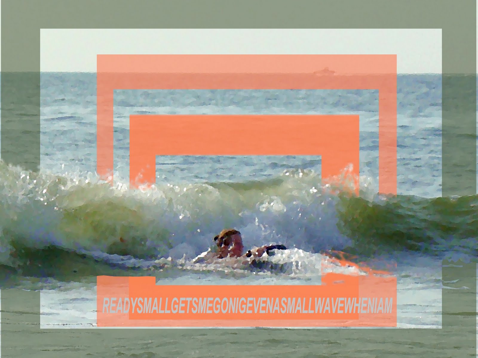
Earlier I promised that I would continue my discussion on the direction my art focus is taking me. As I had said, an attempt at reproducing what I saw and experienced on the natural world was like taking something alive and vibrant and killing it. It was enough to cause me to loose much of my enthusiasm for painting. In looking for new direction, I seriously considered undertaking a Masters of Fine Art at VCU's highly regarded art school. In order to get in, I had to put together a body of work with convincing intellectual content. It didn't take much to find what has been inside me all the time. In the nineties for the senior year thesis, I produced a body of work that looked at layered realism. There was the immediate visual layer, then the deeper level of the real person; personality, spirit, experience, idiosyncrasies etc. In order to express that, I used deformed text to form the image. The image was actually formed by the text. I was expressing the fact that there is more to a person than what we instantly see, But you can only get to that if you make a connection with them. In the paintings, you could only discover the deeper things I was saying if spent a lot of time deciphering the text. The text though was also somewhat deconstructed, so that when you were finally able to read it, the meaning was not what I experienced, but became a catalyst to what the viewer was feeling while connecting to the painting.

While preparing the folio for VCU, I tapped into my the thoughts that I was having about connectedness and disconnectedness. I still want my paintings to have visual impact. I want them to be beautiful, breathtaking in the skill level demonstrated, and yes even decorative. But I also want them to be a catalyst. I want them to simulate the viewer to start thinking about the importance of our connection to all things.  In the end I didn’t persue am MBF, but the process has me on track again.  I have renewed the connection between where my spirit is, and what I am expressing in my paintings.

Monday, June 13, 2011

not much

I have had to get up early to write this because I also have to go to work full time in Wal-mart. But today was my father's birthday, so after talking to him there is only time to get breakfast feed the animals dress and leave. No painting yesterday either what I would give to be able to work painting full time. I am working at it, just have to jump sales a bit. I will try to do some painting tonight. I have a lot of pictures that I have never finished here is one of them. I am contemplating adding text and changing the background that is not working at all. It is very small, 8"x10". Animals I photographed in a Texas park. I would appreciate any input, after all that is part of the connection I would like to have with my audience.

Sunday, June 12, 2011

Using reference photos

Detail from original reference photograph
How I changed them in the digital sketch
The drawing on canvas to start painting
The use of reference photographs is becoming increasingly admitted to. I use them extensively. It allows me to capture accurate moments in time. But there is also a danger in using them, especially using prints. In traditional old prints, the colors become averaged out. Greens especially get unnaturalness to them. When you look at them carefully, trees and grasses have a rich diversity of color which a photo will often average out. Slides are much better. When I first started to use photographs, I had a simple viewer I frequently referred to. It was very clumsy though. Now I work digitally. I can manipulate and enrich a photograph. I can also compline several different exposures, so that the detail that we normally see in shadows and is normally lost in photographs is not lost. While I am working I can change the exposure constantly to see what I have in my minds eye. Photographs are a tool that are best used when you are constantly observing and analyzing the real world. Until recently I was trying to paint a moment captured in a photograph without changing anything. I felt that I was honoring God for the way he had it. I was trying to recreate nature. This caused no end of frustration because what I was actually doing was taking vibrant experiential life then flattening and killing it. I could not really reproduce reality, so why try. This has led to a total rethink of my purpose in painting. More on that next time. I have included A reference photo and what I have done with it.

Friday, June 10, 2011

Drawing of Vicarious Vacation

Vicarious Vacation - 24"x36" with most of the drawing painted in
Detail showing grid and pencil drawing
I spent about 8 hours yesterday and today drawing in my latest painting. For now we are calling it Vicarious Vacation. I started by toning the canvas with an acrylic yellow ochre thinned with medium and water so that when I start painting in, the lights and darks will both show up. Though I plan to be rather loose with much of the background, I am still tight with the drawing. I find that the looser I get, the more important accurate drawing becomes. Most of the figures, (couples) in the picture were very grainy in the reference pictures because they were extremely small and had to be blown up. In the drawing I had to do a lot of interpretation from my knowledge of anatomy. I am happy with the way it is progressing. I will not get a lot more done on it for another week. The basic drawing was done in pencil. I have then gone over it with raw umber oil paint made very thin with turps. When I have finished the drawing, I will establish lights and darks using a monochrome of raw umber and white, and then block in basic colors using oils made very thin using turps.

Thursday, June 9, 2011

Drawing from the lap top screen

It was quite exciting to have actually started this blog.  It has already achieved 2 things.  Firstly it has made me feel energized to actually paint.  I have found that when I have a lot of work sitting around doing nothing, I get a kind of creative log jam.  I believe that the blog will permit me to unblock that.  Today, a day off from work, I have been busy drawing up the latest painting.  At 24” x 36” it is, what is now my standard larger work.  Today I got most of the pencil drawing done, and have started to paint the drawing in.  I will have some pictures of that tomorrow. 
When I am drawing, I first grid up the canvas.  With this one I have used a 2” sq. grid.  I then transfer the picture straight from the screen of my laptop.  I do most of my photo manipulation with basic software, not Photoshop.  I mostly use ACDSee.  When I want to transfer more detail than the grid will allow, I crop a grid square.  The crop tool has its own grid that I can use as a guide.

Wednesday, June 8, 2011

A beginning at blogging


In this blog, I am going to share in real time what I am doing with my art. I am also going to share some of my philosophy connected and disconnected with my art. At the moment I am in a very changing and creative time. I have 4 paintings currently being juried to see if I can join the McGuffey art Center in Charlottesville VA. as an associate artist. I should know by the end of the month. I now have the base color painted for my next painting. This is the photo sketch for it. The motivating thought is of the disconnected lives we live. The vacation can become about the pictures rather than the event in its self. I will start painting tomorrow. I want comments, because I think art must be not only self-expression, but it must make a connection with the viewers.